

Most Abbotsford customers do not wait until they get home to a desktop. They search between appointments, compare options in a parking lot, and call the business that looks easiest to reach. Mobile-first web design starts with that reality instead of squeezing a desktop layout onto a small screen later.
Impossible Web Design builds mobile-first experiences for Fraser Valley companies that need speed, clarity, and frictionless contact—especially service businesses where a phone tap often beats a long form. The goal is not a smaller version of your desktop site; it is a decision-ready experience for people in motion.
What mobile-first really means
Mobile-first is a design priority, not just a responsive checkbox. You design the essential content and actions for a phone viewport first, then expand for larger screens. That forces better decisions: shorter headlines, clearer hierarchy, and fewer distractions that only look impressive on a wide monitor.
If a section does not help a visitor decide or act, it probably does not belong above the fold on mobile. Desktop can add supporting detail; mobile should protect the path to contact. Teams that reverse this order usually ship beautiful desktop pages that frustrate phone users.
- Primary CTA visible without hunting
- Readable type without pinch-zooming
- Tap-friendly buttons and form fields
- Fast-loading images and lean scripts
- Local trust signals early in the scroll
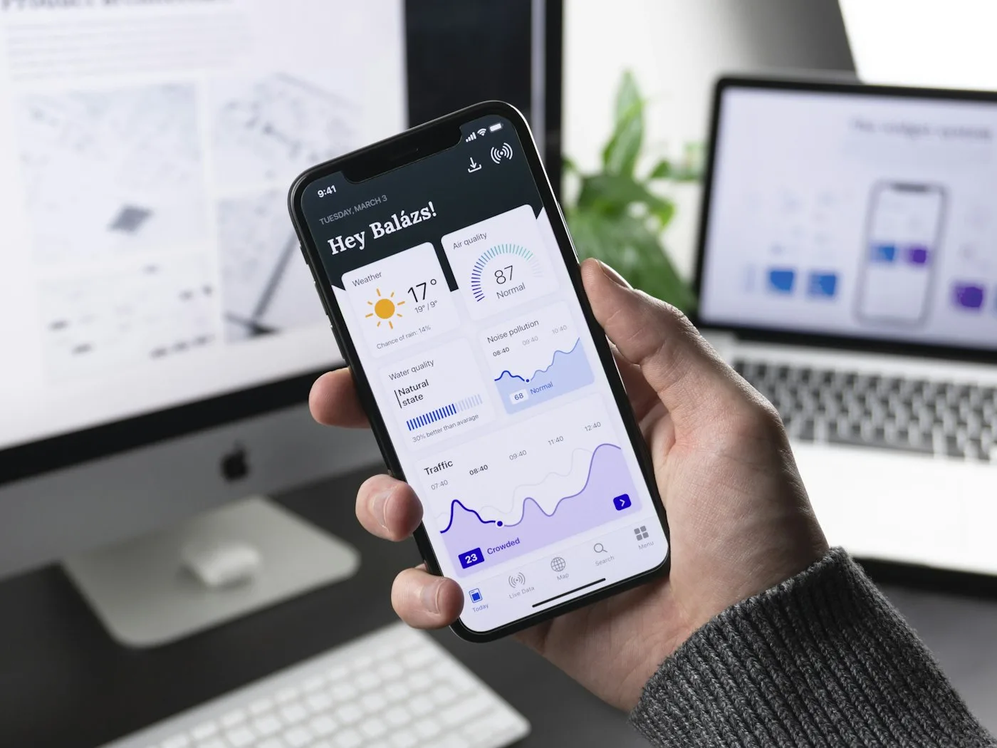 Mobile-first layouts put Abbotsford contact actions within easy reach.
 Local behaviour patterns in Abbotsford
Fraser Valley buyers often need answers quickly: hours, service area, pricing approach, and availability. Put those answers near the top. Display a click-to-call number prominently. If you serve Abbotsford, Mission, and surrounding communities, say so clearly so visitors do not bounce looking for coverage confirmation.
Maps and directions help for storefronts and clinics. For mobile trades and on-site services, emphasize booking and response time. Your website design should match how people actually hire you, including evenings and weekends when many local searches happen.
Forms that people finish on a phone
Long forms kill mobile conversions. Ask for name, contact method, and the essentials. Use smart field types for phone and email. Offer an alternative—“Prefer to call? Tap here”—so customers who dislike typing still convert. Custom workflows can be built with custom coding when you need booking rules, file uploads, or CRM routing that a generic form plugin cannot handle cleanly.
Reduce cognitive load with progress cues on multi-step forms, but do not invent extra steps for vanity data. Every additional field is a chance for someone in a truck cab to abandon the process.
Performance is part of mobile UX
A beautiful layout that loads slowly still loses. Compress images, lazy-load below-the-fold media carefully, and avoid heavy page builders that ship unused code. Pair design improvements with solid hosting so your server response does not undo front-end work.
Test on real devices when possible. Emulators help, but cellular conditions around the Fraser Valley can expose issues that office Wi-Fi hides. Watch how sticky headers, chat widgets, and cookie banners compete for scarce screen space. If three overlays appear before the headline, you are training people to leave.
Visual design that stays clear on small screens
High-contrast text, consistent spacing, and restrained animation keep content readable. Branding still matters on mobile: a clean logo mark, consistent colours, and professional photography reinforce credibility in seconds. If your identity assets are inconsistent across channels, strengthen them through logo and branding so the mobile site feels polished rather than improvised.
Use short supporting sections rather than dense paragraphs. Break services into stacked blocks that scroll naturally. Keep secondary navigation out of the way until needed, and avoid carousels that hide key offers behind swipe gestures many users never discover.
Measure mobile outcomes, not just traffic
Track mobile form starts, call clicks, and completed inquiries separately from desktop. If mobile traffic is high but conversions are low, the issue is usually UX friction, not awareness. Fix the path before spending more on ads that send even more frustrated visitors to the same broken experience.
Review heatmaps or session notes for rage taps, accidental zoom, and abandoned forms. Small fixes—larger buttons, shorter intros, sticky call bars—often outperform a full visual redesign for Abbotsford service brands.
Impossible Web Design is local to Abbotsford at 35533 Angus Crescent. We design with Fraser Valley phone behaviour in mind and can review your current site for quick mobile wins. Reach us at 1-604-854-8065 or info@impossiblewebdesign.com.
Want a site that works as hard on phones as it does on desktops? Contact Impossible Web Design to plan a mobile-first upgrade for your Abbotsford business.